
Visual Texture
A journey through weathered surfaces, coastal memories, and the quiet conversation between marks and materials.
Visual texture continues to be one of the things I am most drawn to in my practice. I am fascinated by surfaces that carry evidence of time—scratches, peeling layers, stains, erosion, faded paint—marks that feel lived-in and hold a kind of memory.
Lately, I have been experimenting with textured papers inspired by Kasia Clarke’s courses on indirect mark-making and collage paper creation. Her approach has opened up new ways for me to think about surface and layering. I highly recommend her courses to anyone interested in developing a more experimental approach to visual texture.
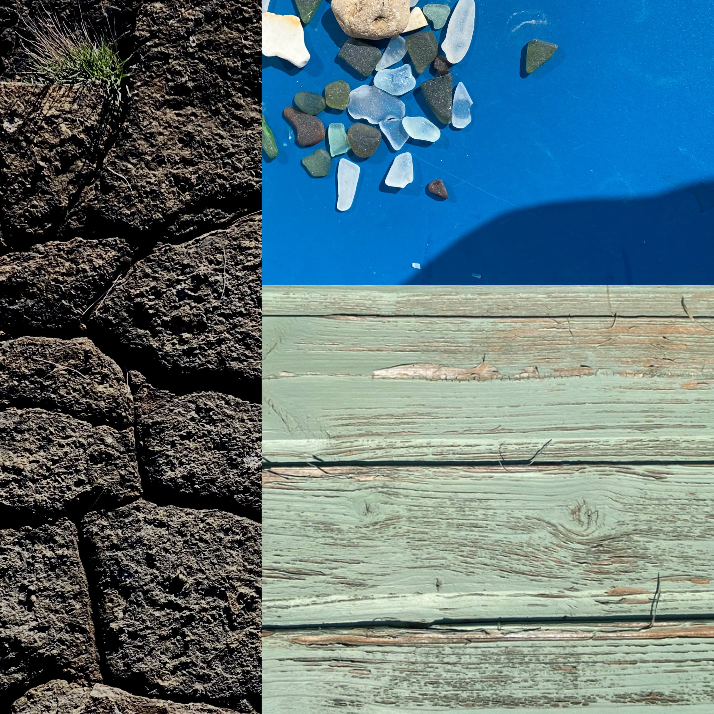
For these studies, I returned to some of the photographic resources I mentioned in my previous blog, Fife Coastal Path (Part 1)—particularly close-up photographs and photo grids collected while walking the coastline. They continue to offer a rich starting point for abstract exploration.
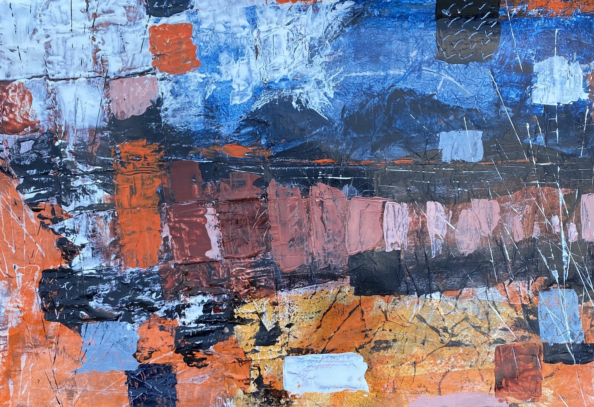
Weathered Surfaces: The Skin of Battered Boats ⚓️
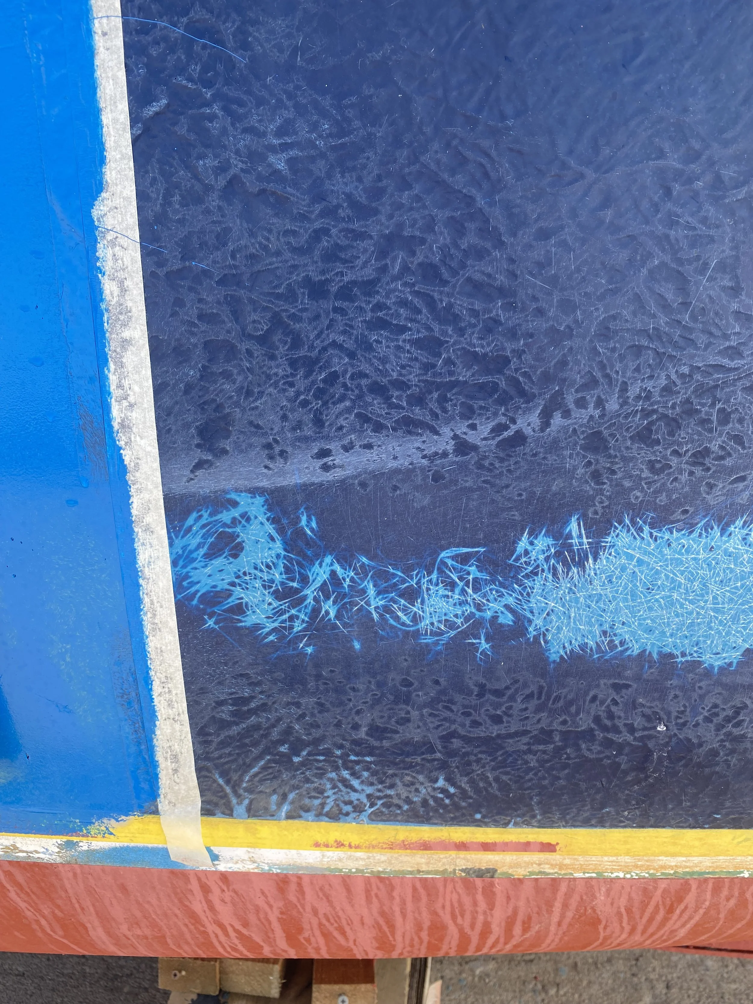
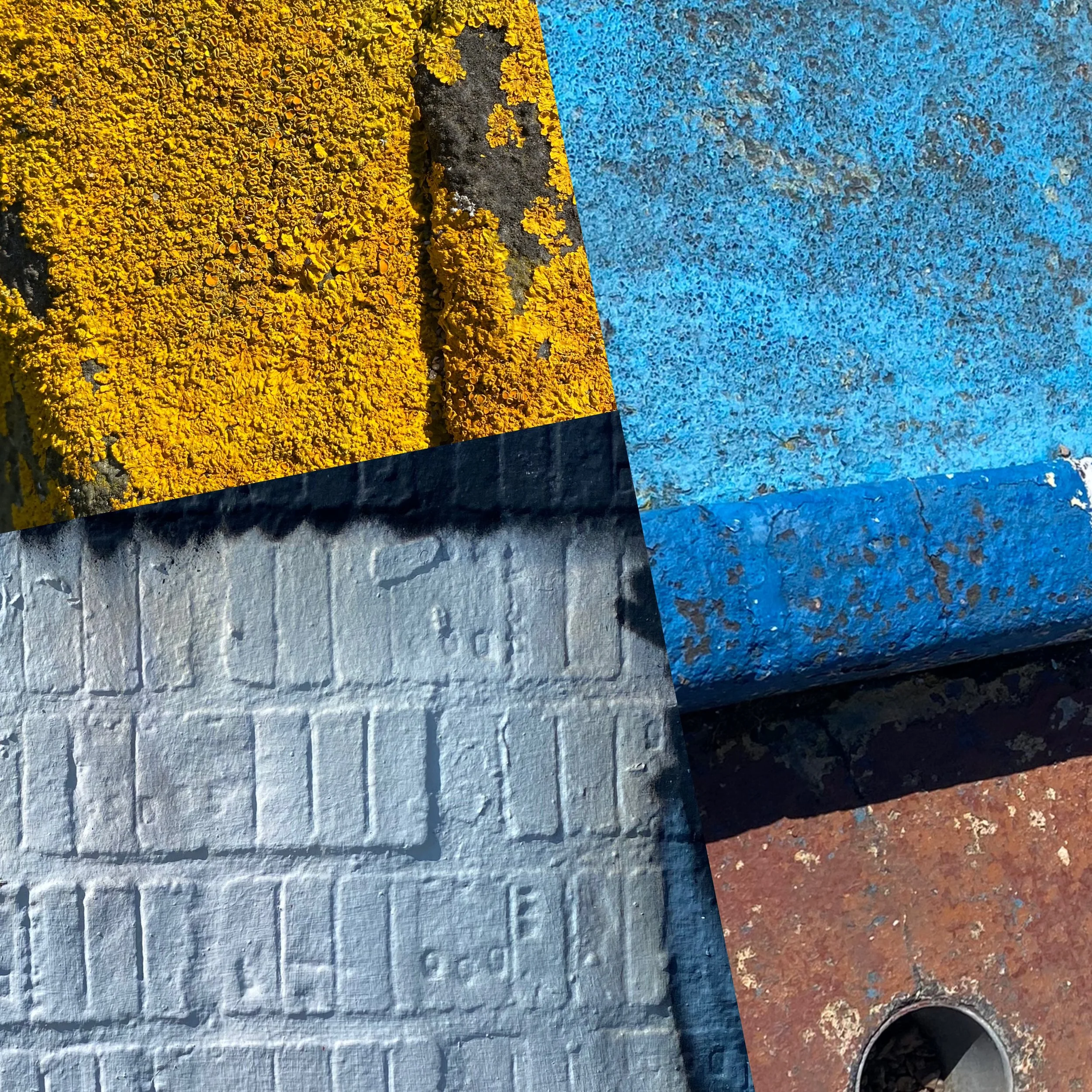
I began this study from a close-up photograph of a fishing boat I took in Anstruther.
What interested me most was not the boat as an object, but its surface—the peeling paint, rust stains, scratches, and layered colour built up over time through exposure to salt, wind, and use.
Using paint transfer techniques, I tried to reveal marks that echoed those weathered textures. I worked across both paper and wood panel.
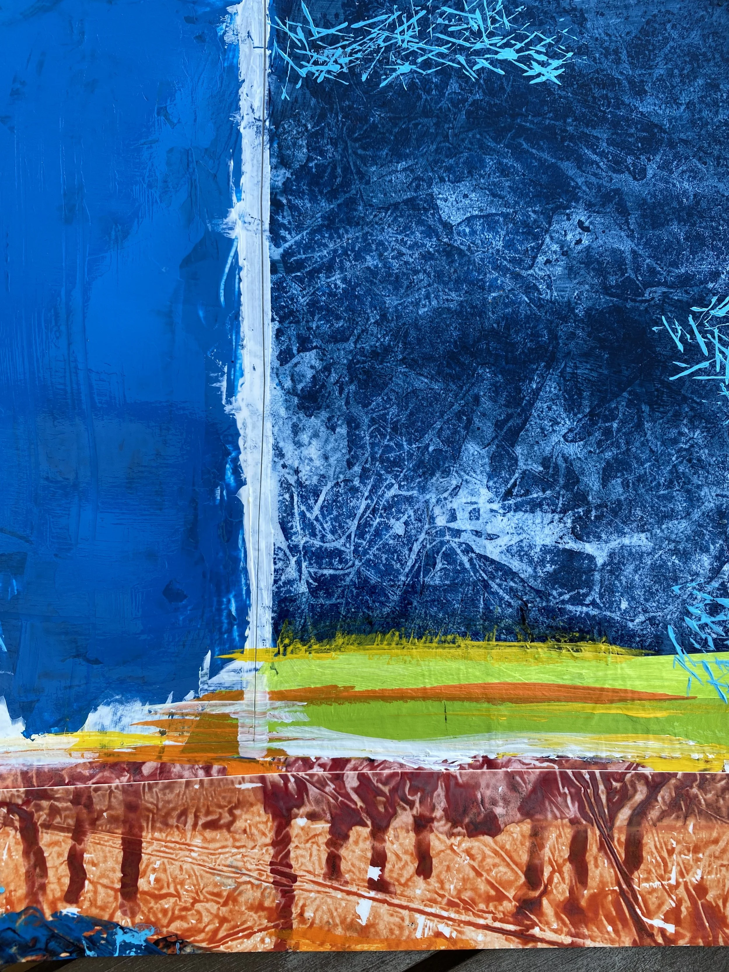
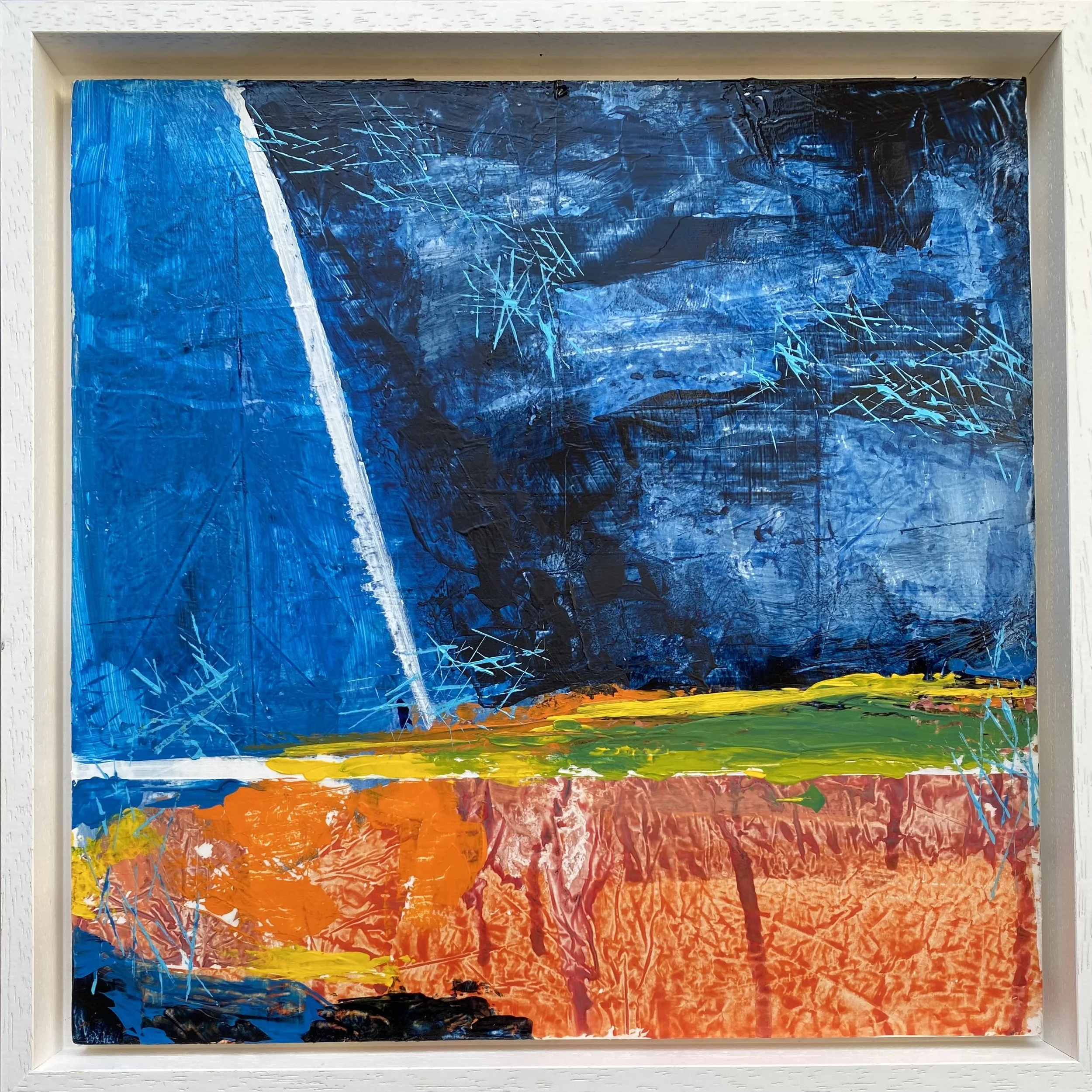
The rich blues carry the atmosphere of cold water and overcast skies, while the vibrant orange and rusty red below feel grounded in oxidised metal, peeling paint and harbour surfaces. Between them, a sharp band of yellow-green creates an interruption, almost like a horizon, a tide line, or the meeting of land and water. Scratched cyan marks animate the surface throughout, recalling the fine lines left by wind, salt or water.
The composition reminds me of Richard Diebenkorn’s Ocean Park series, particularly the interplay between geometry and atmosphere, and the way colour fields hold both structure and openness.
Coastal memories 🌊
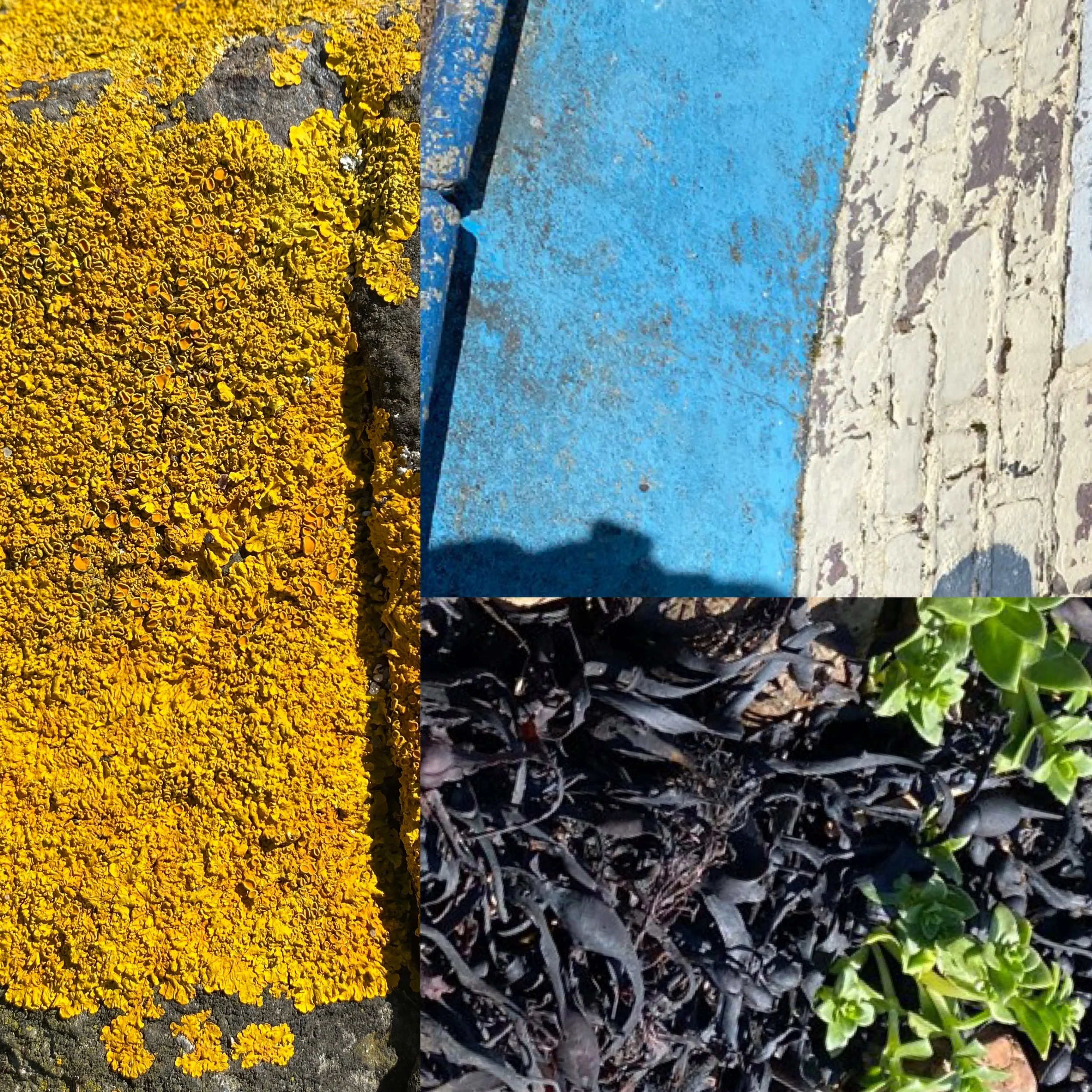
Working with photo grids gives me an immediate sense of possibility. They provide a quick overview of the landscape while also suggesting ways it might be broken apart and translated into an abstract composition.
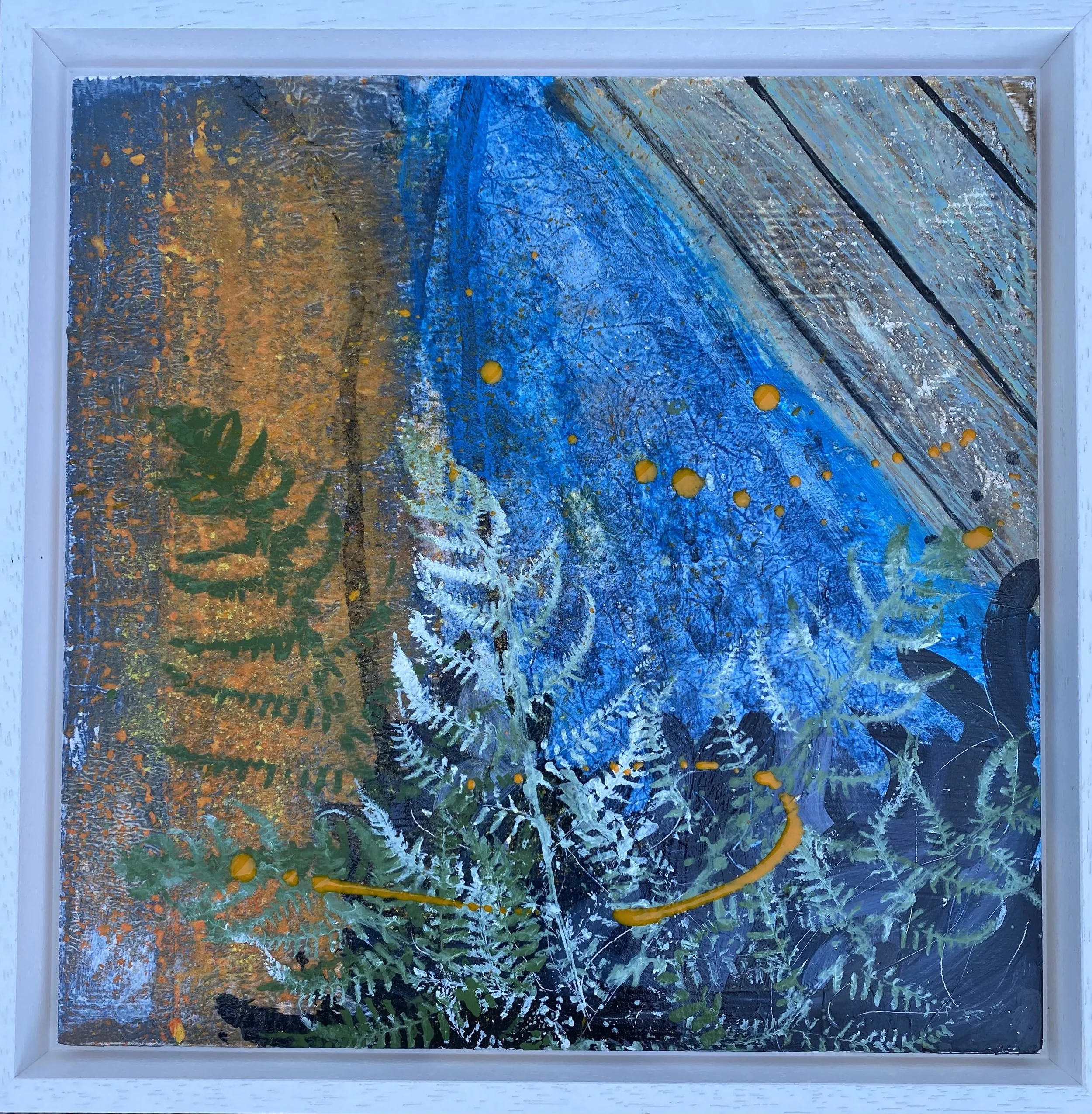
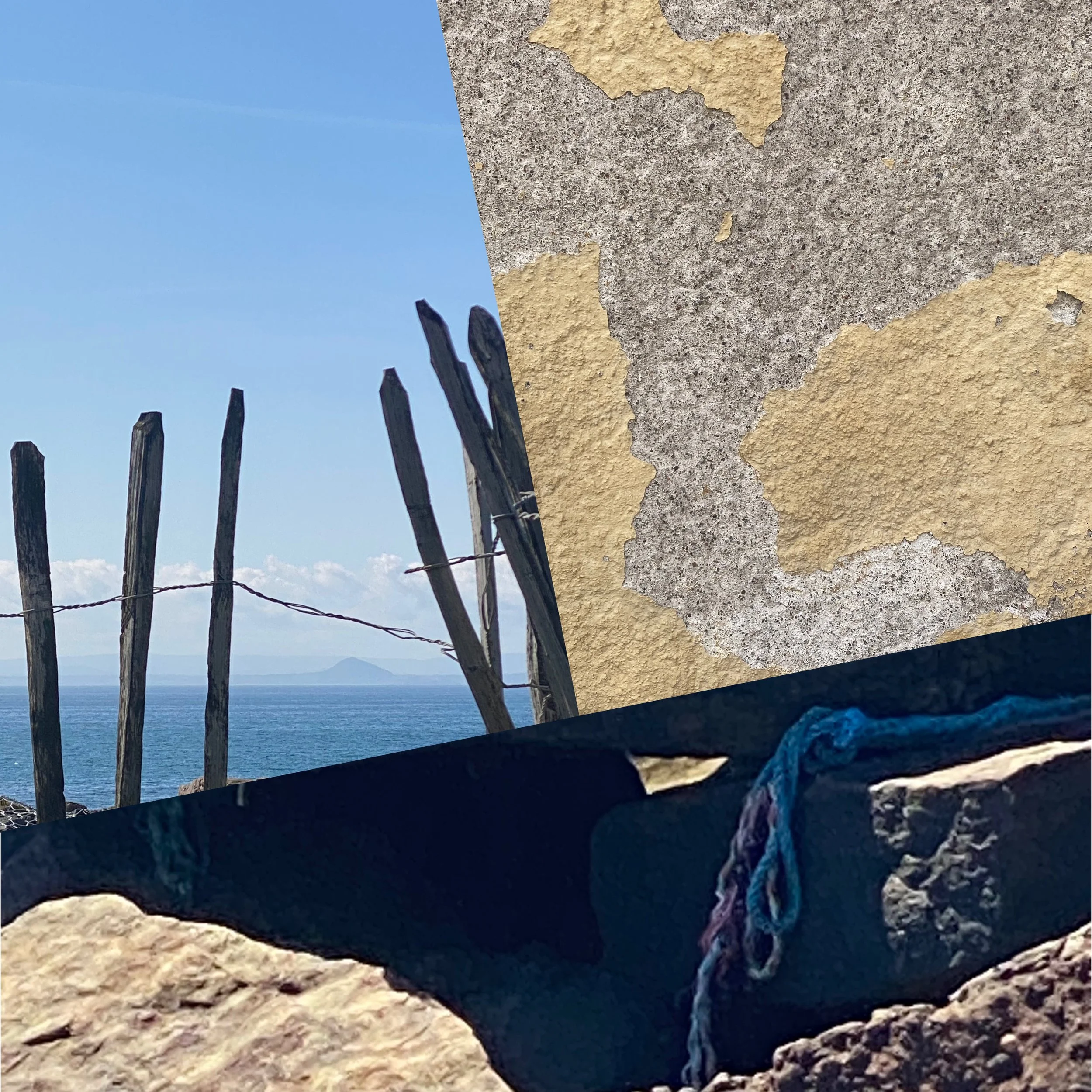
For this study, I combined a couple of photo grids of grey rocks draped in orange lichen, tangles of vegetation, and the weathered timber panels of seaside huts faded to antique green earth.
As I worked, these elements began to overlap and merge.
I introduced some fern into the mix, a deliberate clash, its structural, inland green interrupting the softer, more bleached palette of the coast.
In the resulting work, you can feel a place without quite being able to name it.
Weathered brick walls 🧱
Walking along the coastal path, I noticed low brick structures with walls blistered by years of exposure to sea salt and wind. The painted surfaces were cracked, faded, peeling back to reveal earlier layers underneath. They carried a rich history of weather and time.
Using collage, paint transfer, and multiple paint applications, I worked to recreate that layered weathered quality. I worked on an A2 paper, which gave me more room to move between larger areas of texture to capture the feeling of surface decay and beauty, erosion and resilience.
Reflections
These studies are like an ongoing process of discovery - testing materials, pushing techniques, and seeing what holds. It takes time to understand how these experiments might settle into the wider language of my work.
What is becoming clearer is how much I am drawn to surfaces that show evidence of change: weathered paint, worn wood, rust.
I will continue posting as the work develops, and I am curious to see what the coastal path still has to offer.