
Composition and Value
This week I focused on composition—an ever-evolving process that sits at the heart of visual storytelling. I continue my exploration of monochromatic work, using it as a foundation to better understand design and tonal value.
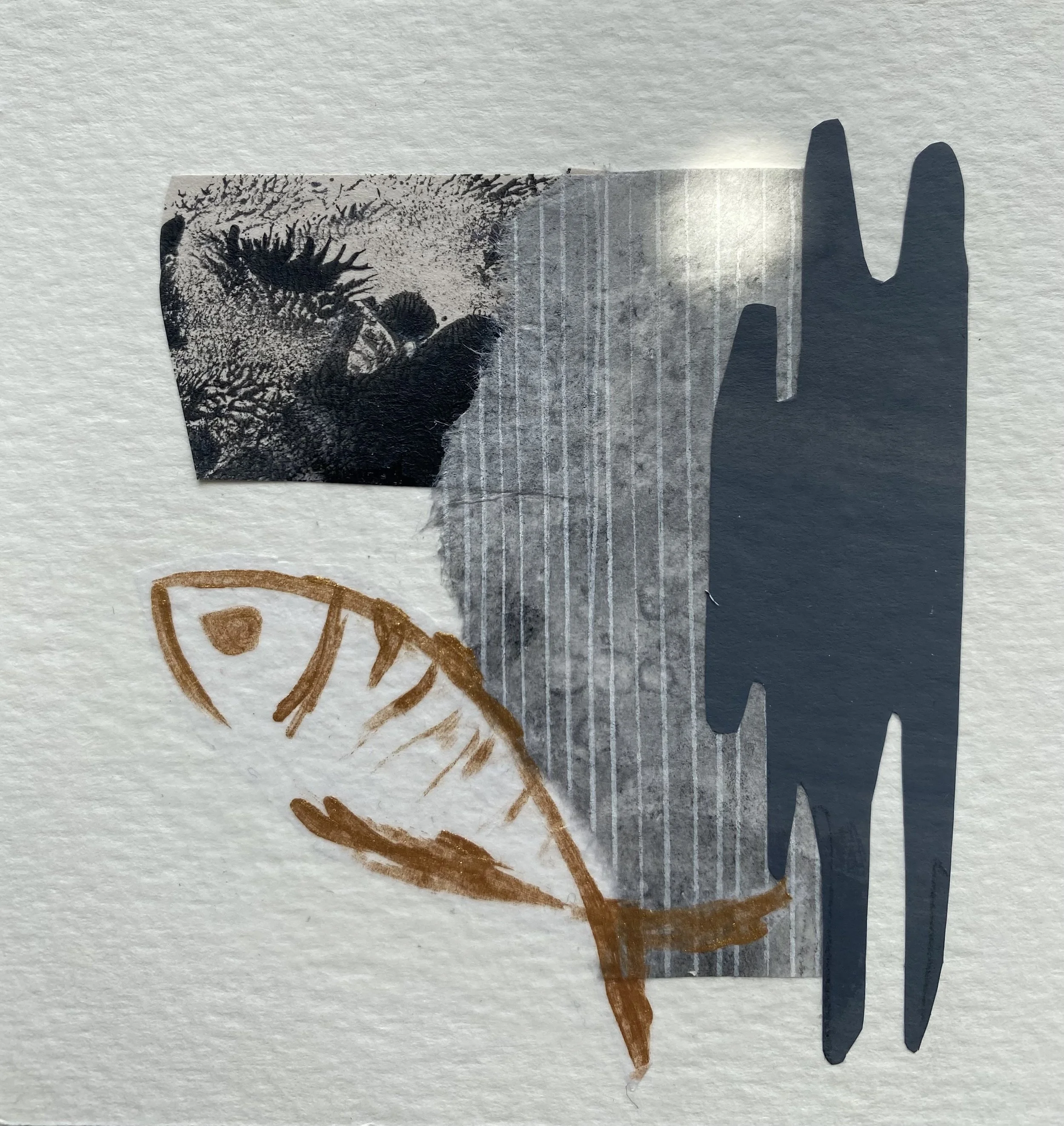
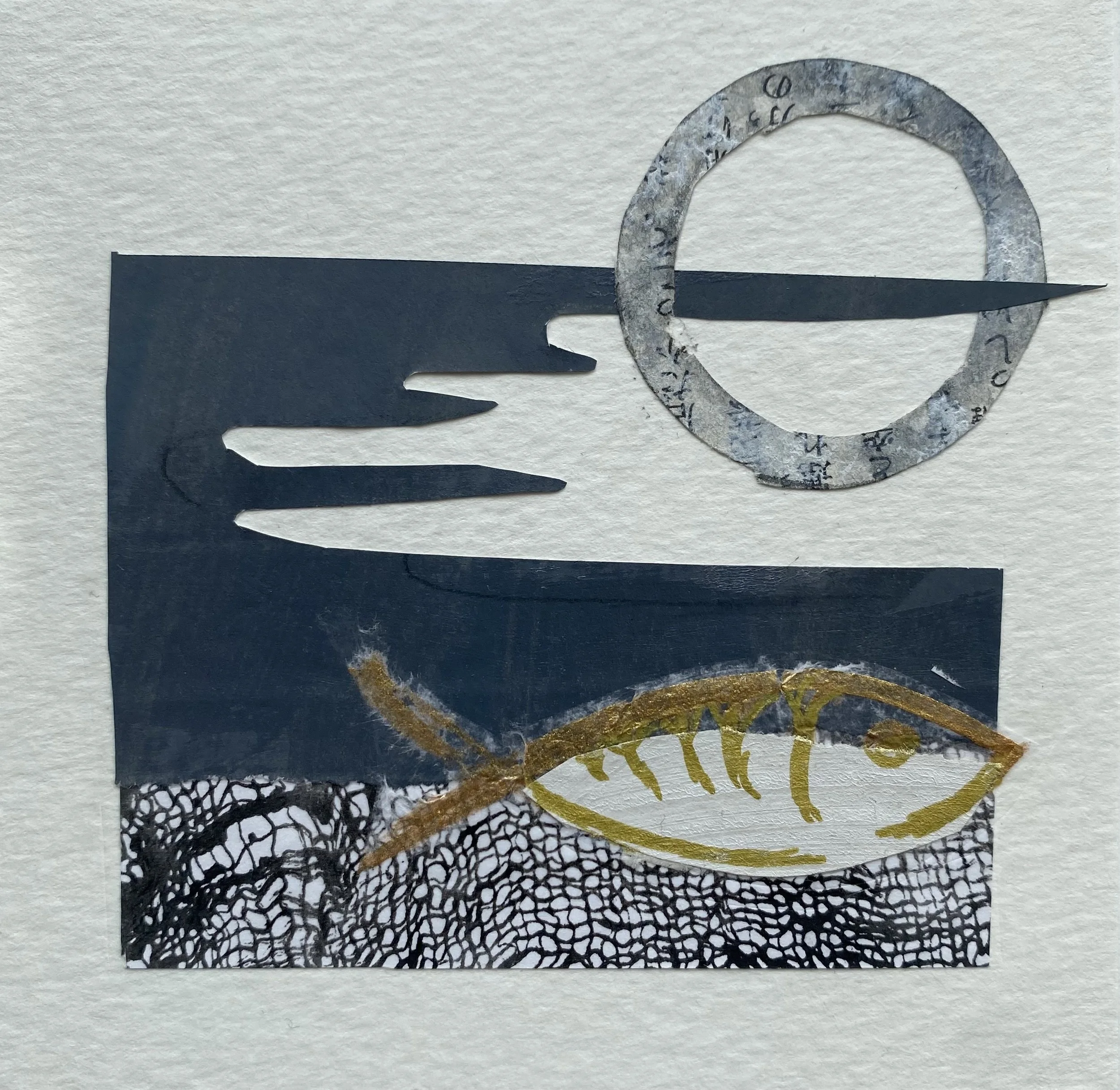
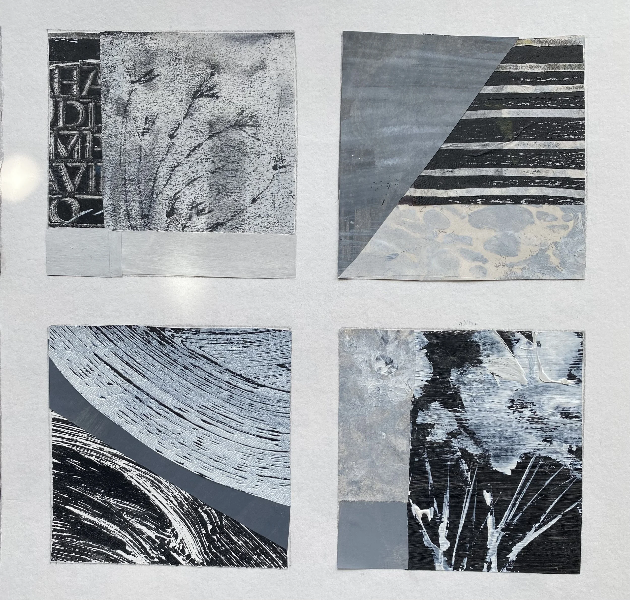
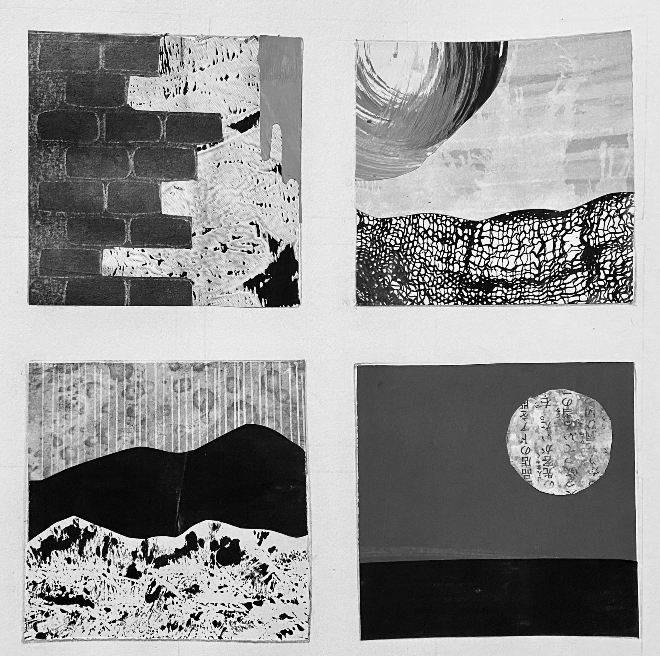
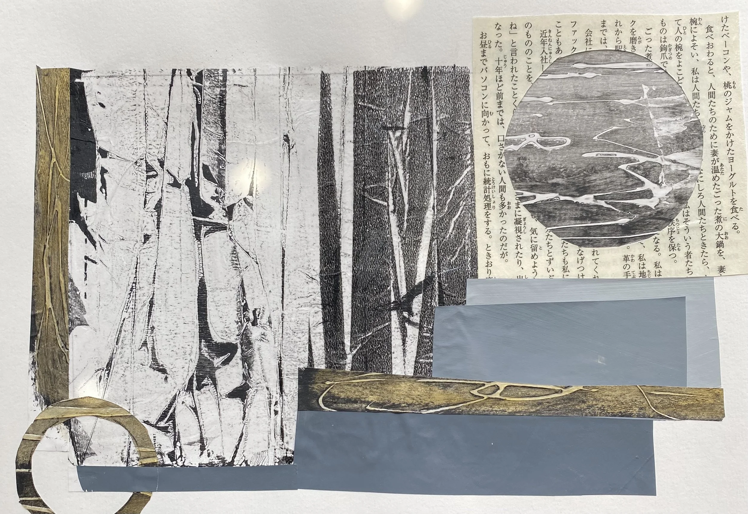
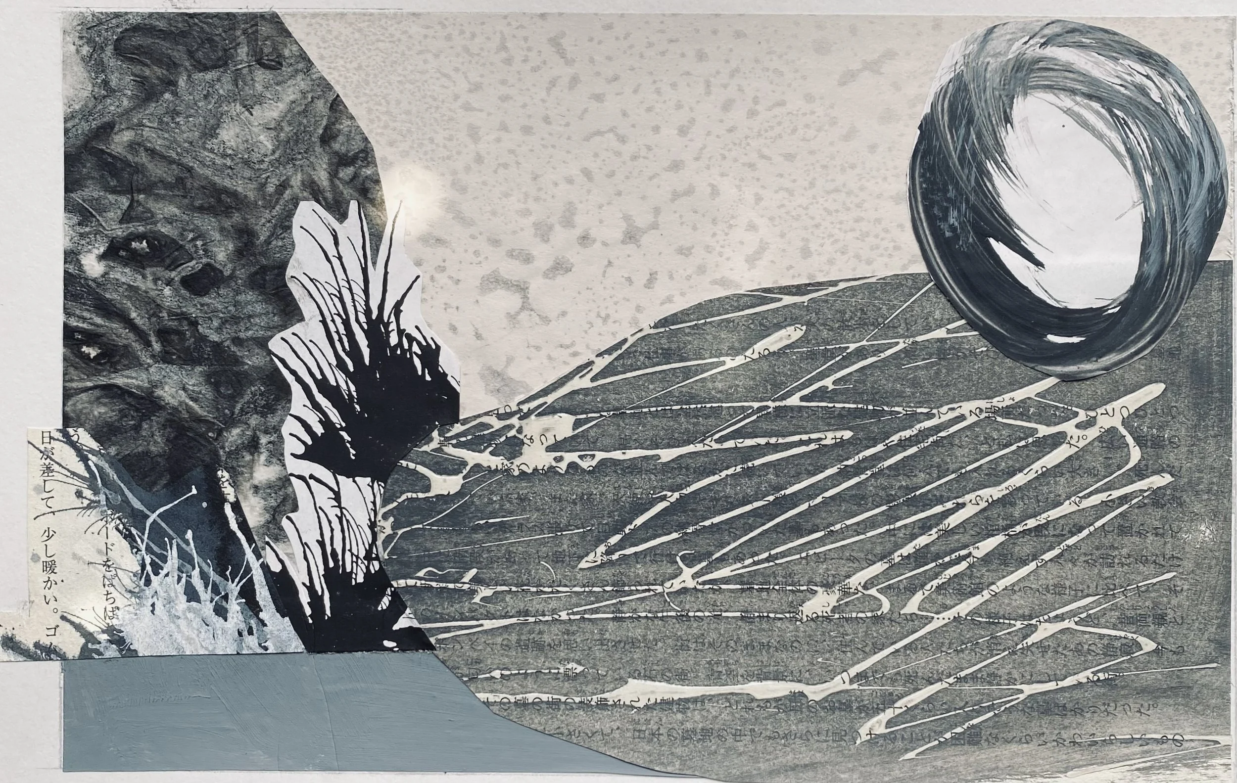
One of the most accessible and playful ways to engage with composition is through collage. There’s something immediate and tactile about cutting and arranging shapes. I often begin with a grid to create a sense of order, limiting myself to three or four tonal values to keep the composition cohesive. At other times, I move into a more freeform approach.
Creating my own collage papers has become an important part of this process. Using different techniques to build texture and variation adds another layer of interest.
I also find myself returning to the use of gold, either as a subtle embellishment at the end or integrated directly through gold papers to introduce a contrast in texture and light.
Distilling the Essentials
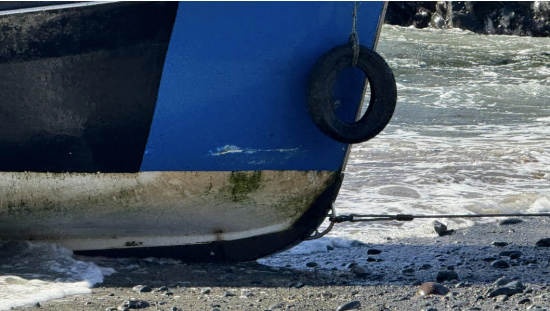
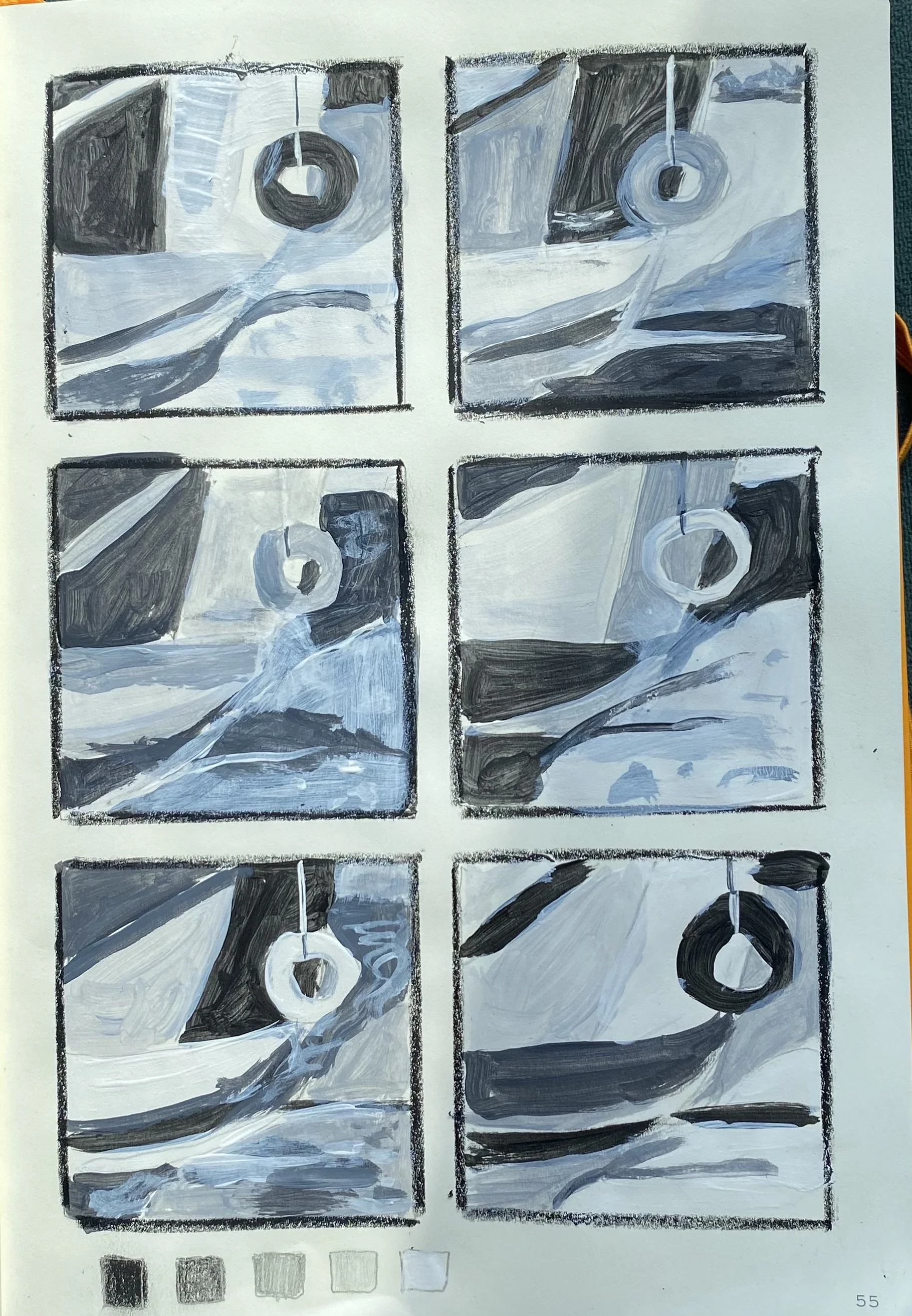
I began with a photograph and distilled it down to its essential elements, simplifying it into basic shapes while exploring tonal relationships in my sketchbook. This process clearly reveals the connections between value, shape, and line. When these elements align, the composition feels intentional, balanced, and vibrant. And when they don’t… you know instantly. It’s all part of the learning process.
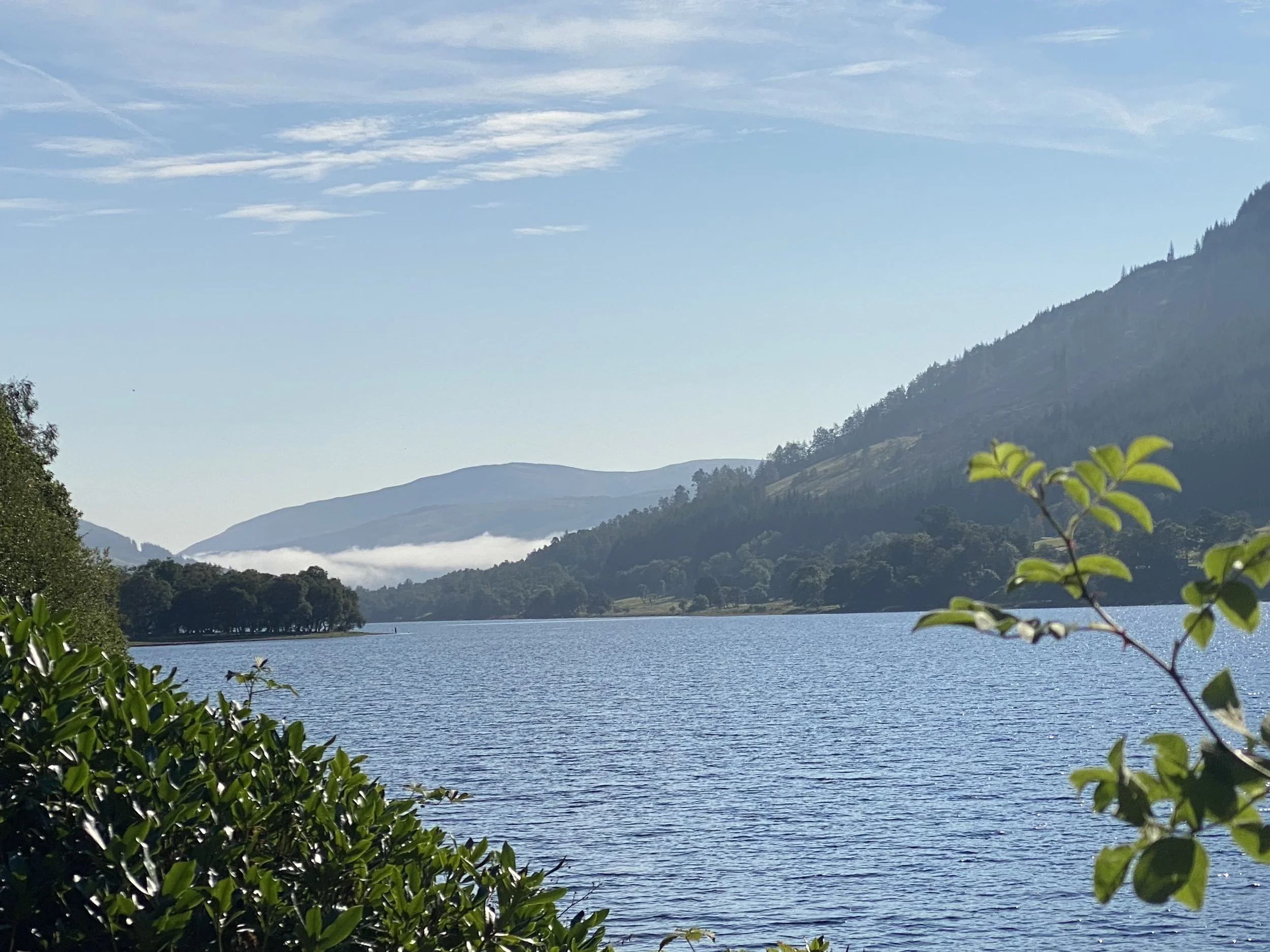
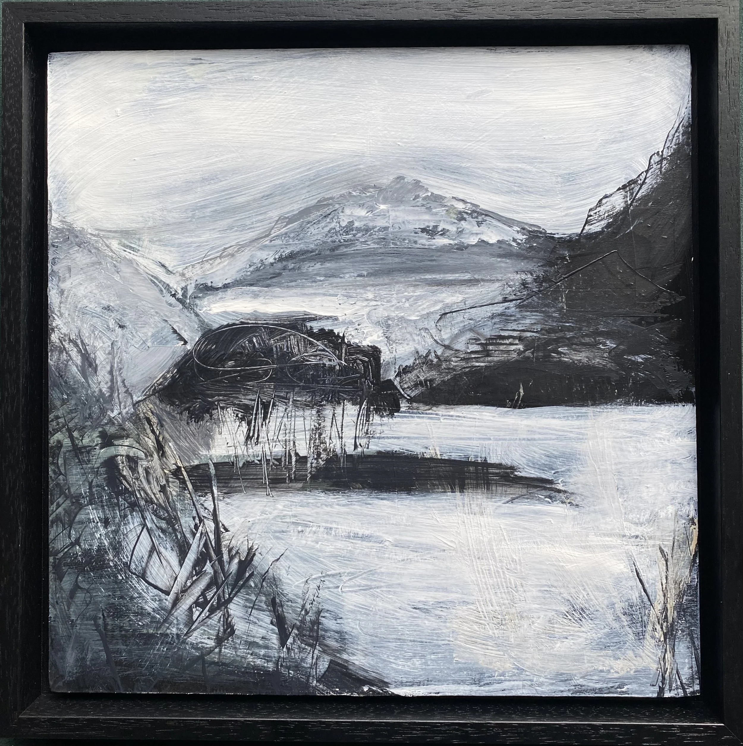
Abstracting from Landscape
Much of my inspiration continues to come from the Scottish landscape, particularly a place in the Trossachs near Loch Voil that I revisit often. Recently, I took a bright summer photograph from this location and translated it into a simplified monochrome painting. The result surprised me—it transformed into a stark, atmospheric winter scene (shown below in progress). By pushing the tonal values further, even experimenting with inverted, negative-like effects, the image could take on a darker, almost nocturnal quality. These shifts reveal how much mood and narrative can change through value alone.
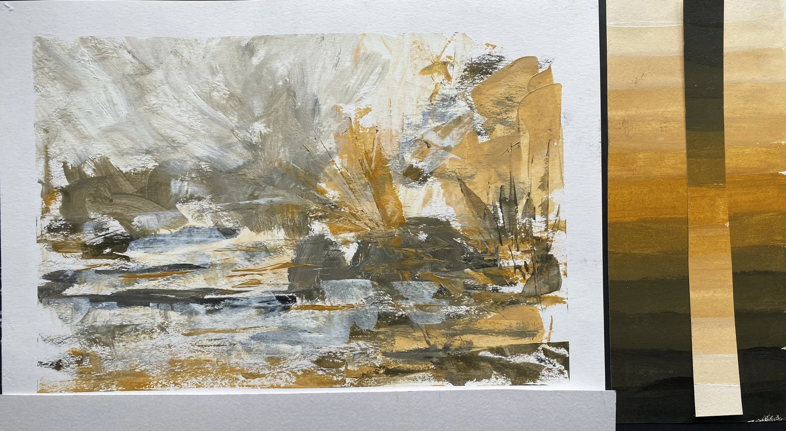
The Quiet Power of Ochre
There’s something quietly powerful about limiting your palette. In this study, I continued my monochromatic exploration by choosing a single colour—yellow ochre—and working only with that, alongside black and white. At first glance, it might seem restrictive, but in practice, it opens up an entirely different way of seeing.
For this piece, I deliberately kept everything close in tone, working mostly within soft midtones. There are no harsh contrasts or dramatic shifts—just gentle transitions that build a quieter, more ethereal mood.
Overall, this phase of exploration feels like laying groundwork. Through monochrome studies, collage, and abstraction, I’m not just creating individual pieces—I’m developing a way of seeing. And from that, new directions are beginning to take shape.